Bike Share Map

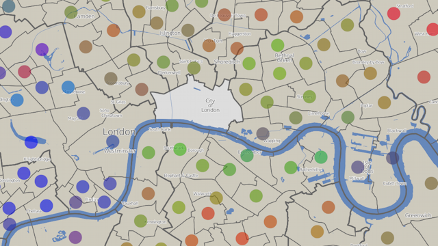
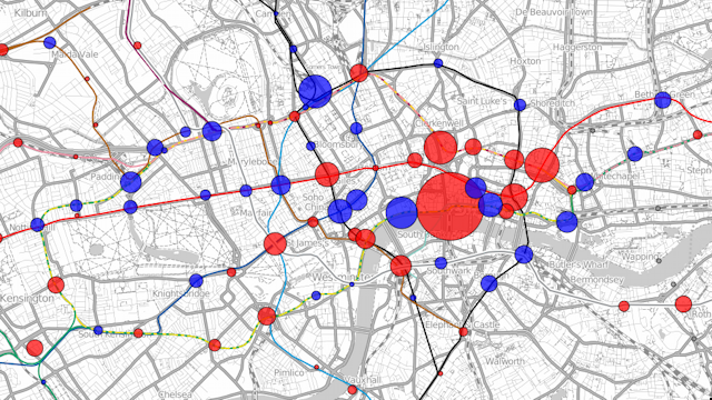
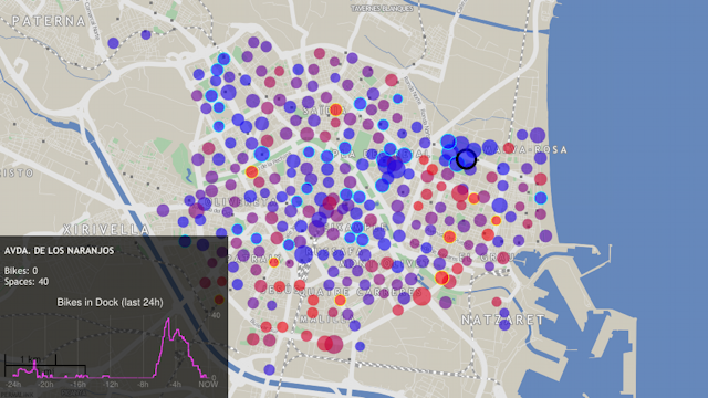
A visualisation of docking station states for around 50 cities with bicycle-sharing systems (similar to London’s Barclays Cycle Hire) across the world. Each circle, representing a docking station, moves from blue to red as the docking station fills up with bikes. The area of the circle represents the total size of the docking station. AJAX is used to load in the latest information every few minutes. The visualisation allows overall usage patterns to be seen during the day – the patterns being different for each city. An animation mode replays the last 48 hours, allowing commuter flows and other distinctive characteristics to be spotted. Various different colour schemes are available.

The background map is a custom render of OpenStreetMap data. It is designed to show relevant contextual information without distracting from the featured data.

Bike Share Map has been retweeted over 5000 times and derivatives of it have featured in magazines and newspapers including National Geographic Magazine (US June 2012 edition).

The map can be viewed at http://bikes.oobrien.com/. The above map is showing the bicycle-sharing system in Valencia, Spain.

London Council Elections

An interactive map showing the “colour” of each London ward, based on the results of the London Council Elections in May 2010. Each vote is considered to be red for Labour, blue for the Conservatives, and green for all other parties – the average “colour” can then be calculated and is displayed as a dot in the centre of each ward. The background is produced in Mapnik, with the circle symbology displayed using OpenLayers.

The visualisation can be viewed at http://casa.oobrien.com/misc/london/

Acknowledgements: Electoral data from the London Data Store. Ward and borough boundaries from Ordnance Survey Boundary-Line, part of the OS Open Data release. Contains Ordnance Survey data © Crown copyright and database right 2010. Background contextual data from OpenStreetMap, CC-By-SA OpenStreetMap and contributors.

Shaded Relief Maps

Using the SRTM (Shuttle Radiographic Topological Mission) data from NASA, and roads and placenames from OpenStreetMap, it is a relatively straightforward process to create a shaded relief map. The map is produced using the GDAL raster manipulation tools, with the labels and roads produced in Mapnik.

The sample here is of a region in north Wales.

Acknowledgements: Relief data from NASA’s SRTM. Contextual data from OpenStreetMap, CC-By-SA OpenStreetMap and contributors.

Health of the Nation

This choropleth map shows the results of the 2001 census question on health – in the greener areas, a greater proportion of the population in each statistical area consider themselves to be of good health, with redder areas indicating smaller proportions. The difference between the rural areas west of London, and north of Cardiff, are striking. A similar disparity can be seen when comparing east and west London.

Medium: Web. Acknowledgements: Census data is from the 2001 Census Area Statistics tables. Crown copyright 2003. Crown copyright material is reproduced with the permission of the Controller of HMSO. Statistical area boundaries from UKBORDERS, an EDINA-supplied service. Contains Ordnance Survey data © Crown copyright and database right 2010. Contextual data from OpenStreetMap, CC-By-SA OpenStreetMap and contributors.

OpenOrienteeringMap – Street Orienteering

OpenOrienteeringMap is an automatically generated map of the world, based on the OpenStreetMap dataset but styled for use in informal orienteering competitions.

The style here is the “Street-O” style, a minimalistic network-style map as used for street orienteering. The map is created on-the-fly using Mapnik, a map creation engine.

Medium: Web and print.

Acknowledgements: Data from OpenStreetMap, CC-By-SA OpenStreetMap and contributors.

Current status: Online for the UK. A new version of the user interface is in development.

London Underground Station Use

Visualisation showing the changes in use of the tube stations in London. The example here is showing the changes in total exits and entries (by foot) to the tube stations between 2008 and 2009. Blue circles show increases in numbers and red circles show decreases. The area of the circle is proportional to the changes in numbers. The largest red circle is for Blackfriars station which was closed throughout 2009. The surrounding stations show increased usage, compensating for this closure.

The visualisation can be viewed at http://oobrien.com/vis/tube/

Acknowledgements: Data from the Transport for London website. Background contextual and tube line data from OpenStreetMap, CC-By-SA OpenStreetMap and contributors.

A Map of Scenicness

This map was created from the results of voting by visitors to the ScenicOrNot, who voted on a representative photo in each square kilometre of the UK, supplied by the Geograph project. A GIS was used to create a surface showing the results graphically. The more green an area, the more scenic it was judged to be. Redder areas scored lower.

The extract here shows the central Lake District, which scored very highly. The scores drop along the corridor created by the M6 motorway.

Acknowledgements: Voting results data from from MySociety ScenicOrNot. Contextual data from OpenStreetMap, CC-By-SA OpenStreetMap and contributors.

Current status: Offline.

Finding the Roads from the Buses

This map is a visual representation of some simple spatial analysis. Shows bus stops on OpenStreetMap, imported in bulk from the NaPTAN (National Public Transport Access Nodes) dataset, overlaid on the standard OpenStreetMap render showing roads. Bus stops which are further than 40 metres from the nearest road are coloured red, to highlight places where a road is likely to be missing and should be targeted by the community when aiming to “complete” the map. The nearness calculation is performed using a spatial SQL query on the underlying PostGIS-based database.

Acknowledgements: Data from OpenStreetMap, CC-By-SA OpenStreetMap and contributors. Includes data from NaPTAN (National Public Transport Access Nodes) which is Crown Copyright and also released under CC-By-SA licence.

Current status: Offline. Following the OS OpenData release, and other improvements to OpenStreetMap data sources, the utility of this tool was largely superceded.