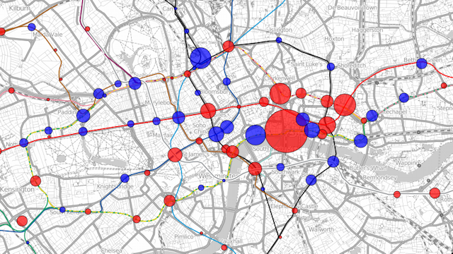
Visualisation showing the changes in use of the tube stations in London. The example here is showing the changes in total exits and entries (by foot) to the tube stations between 2008 and 2009. Blue circles show increases in numbers and red circles show decreases. The area of the circle is proportional to the changes in numbers. The largest red circle is for Blackfriars station which was closed throughout 2009. The surrounding stations show increased usage, compensating for this closure.
The visualisation can be viewed at http://oobrien.com/vis/tube/
Acknowledgements: Data from the Transport for London website. Background contextual and tube line data from OpenStreetMap, CC-By-SA OpenStreetMap and contributors.