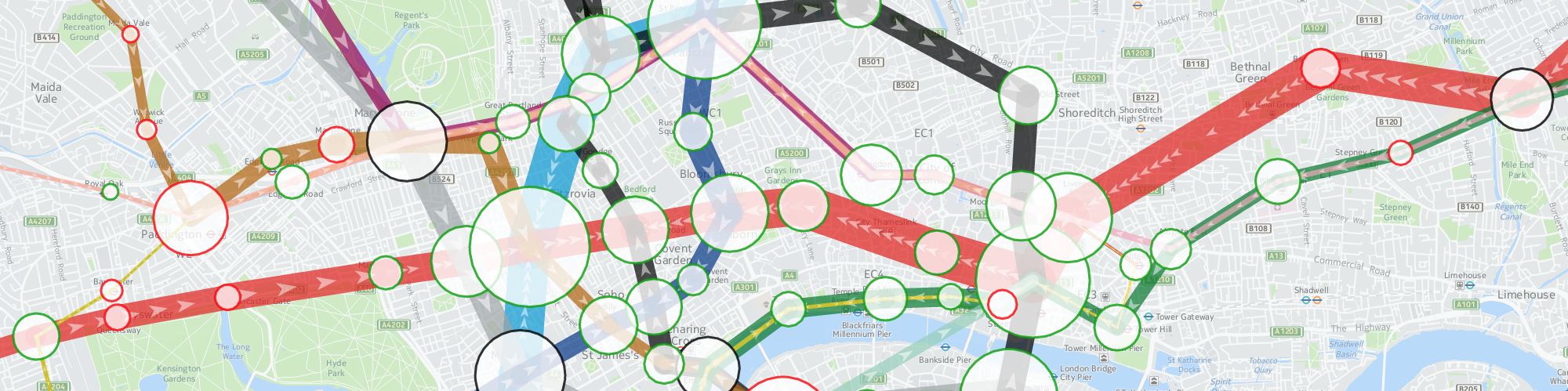
TubeHeartbeat visualises the ebb and flow of commuters on the London Underground, using the HERE Maps developer platform. Click stations and line segments for detailed graphing.
TubeHeartbeat
Spatial Data Visualisation Portfolio
TubeHeartbeat visualises the ebb and flow of commuters on the London Underground, using the HERE Maps developer platform. Click stations and line segments for detailed graphing.
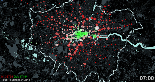
This still is from an animation produced for an exhibition Sense and the City, which was at the London Transport Museum during 2011-12. The animation shows Oyster card “touch ins” and “touch outs” as people enter and leave the network of tubes and (some) trains, using the ubiquitous smartcard. Reds show a net influx into the system, while greens show a net flow outwards.
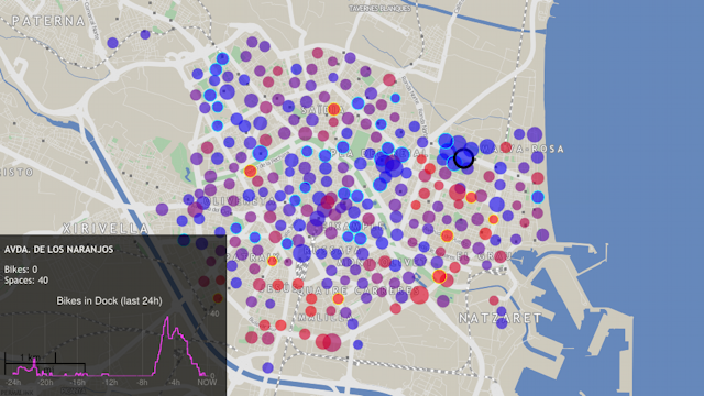
A visualisation of docking station states for around 50 cities with bicycle-sharing systems (similar to London’s Barclays Cycle Hire) across the world. Each circle, representing a docking station, moves from blue to red as the docking station fills up with bikes. The area of the circle represents the total size of the docking station. AJAX is used to load in the latest information every few minutes. The visualisation allows overall usage patterns to be seen during the day – the patterns being different for each city. An animation mode replays the last 48 hours, allowing commuter flows and other distinctive characteristics to be spotted. Various different colour schemes are available.
The background map is a custom render of OpenStreetMap data. It is designed to show relevant contextual information without distracting from the featured data.
Bike Share Map has been retweeted over 5000 times and derivatives of it have featured in magazines and newspapers including National Geographic Magazine (US June 2012 edition).
The map can be viewed at http://bikes.oobrien.com/. The above map is showing the bicycle-sharing system in Valencia, Spain.
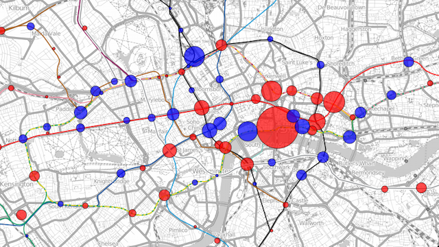
Visualisation showing the changes in use of the tube stations in London. The example here is showing the changes in total exits and entries (by foot) to the tube stations between 2008 and 2009. Blue circles show increases in numbers and red circles show decreases. The area of the circle is proportional to the changes in numbers. The largest red circle is for Blackfriars station which was closed throughout 2009. The surrounding stations show increased usage, compensating for this closure.
The visualisation can be viewed at http://oobrien.com/vis/tube/
Acknowledgements: Data from the Transport for London website. Background contextual and tube line data from OpenStreetMap, CC-By-SA OpenStreetMap and contributors.
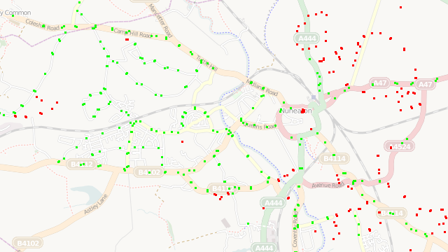
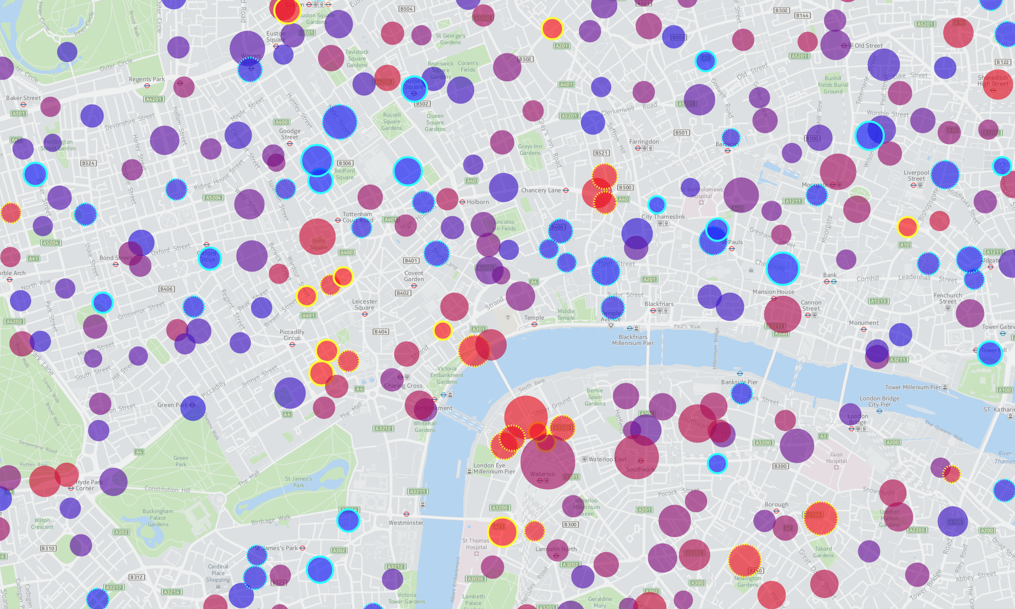
This map is a visual representation of some simple spatial analysis. Shows bus stops on OpenStreetMap, imported in bulk from the NaPTAN (National Public Transport Access Nodes) dataset, overlaid on the standard OpenStreetMap render showing roads. Bus stops which are further than 40 metres from the nearest road are coloured red, to highlight places where a road is likely to be missing and should be targeted by the community when aiming to “complete” the map. The nearness calculation is performed using a spatial SQL query on the underlying PostGIS-based database.
Acknowledgements: Data from OpenStreetMap, CC-By-SA OpenStreetMap and contributors. Includes data from NaPTAN (National Public Transport Access Nodes) which is Crown Copyright and also released under CC-By-SA licence.
Current status: Offline. Following the OS OpenData release, and other improvements to OpenStreetMap data sources, the utility of this tool was largely superceded.