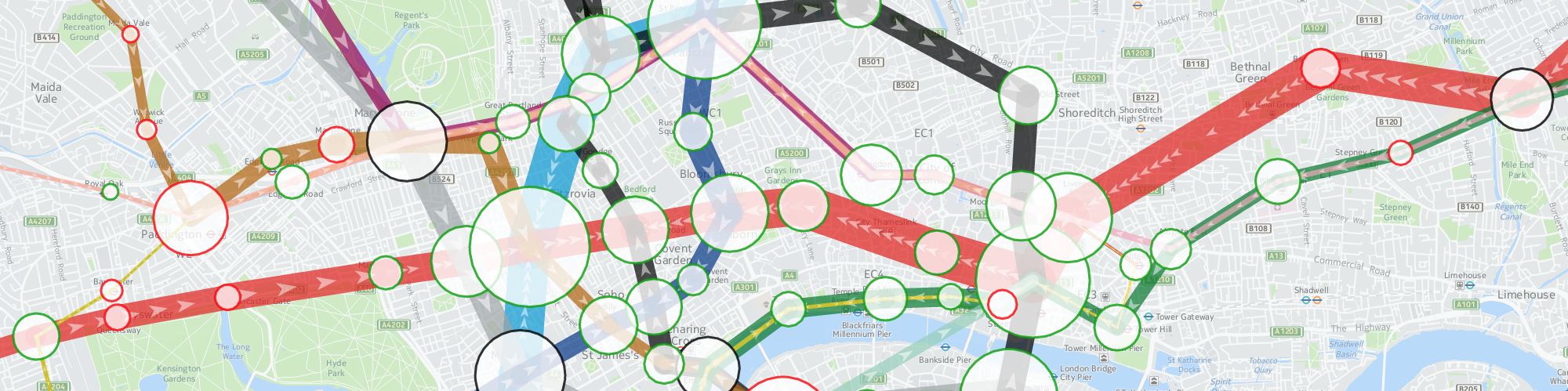
TubeHeartbeat visualises the ebb and flow of commuters on the London Underground, using the HERE Maps developer platform. Click stations and line segments for detailed graphing.
TubeHeartbeat
Spatial Data Visualisation Portfolio
TubeHeartbeat visualises the ebb and flow of commuters on the London Underground, using the HERE Maps developer platform. Click stations and line segments for detailed graphing.
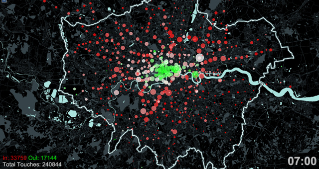
This still is from an animation produced for an exhibition Sense and the City, which was at the London Transport Museum during 2011-12. The animation shows Oyster card “touch ins” and “touch outs” as people enter and leave the network of tubes and (some) trains, using the ubiquitous smartcard. Reds show a net influx into the system, while greens show a net flow outwards.
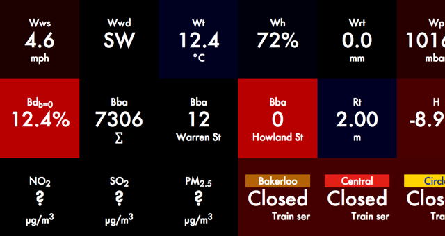
An alternative view of CityDashboard data for London, using its API. Styled with coloured, glowing squares, with deliberately vague captions to encourage the viewer to think about what they mean. It can be viewed at http://casa.oobrien.com/periodictable/

Co-authoring Mapping London, a blog which launched in early 2011 and has quickly become the definitive blog about current and historic mapping of London. Over sixty maps were featured in the first year.
I also designed the user interface for the Mapping London Names website.
The logo for Mapping London was designed by my co-author.
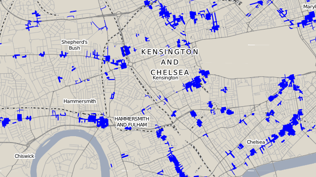
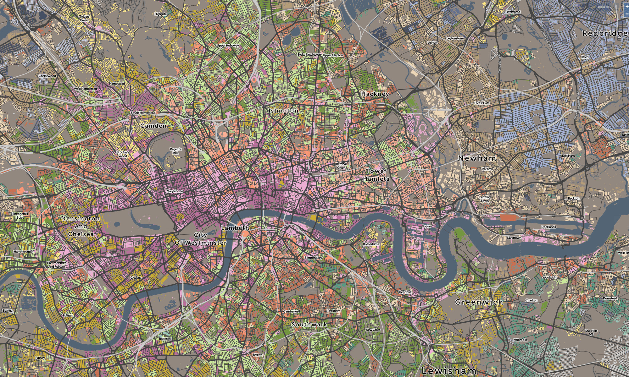
Thickening the streets of west London proportionally based on the linear density of shoplifting crimes recorded along them.
(Work in progress.)
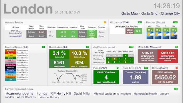
CityDashboard shows real-time, rapidly updating data about a city – combining public transport information, weather and first-hand observations with social media (Twitter) trends and messages. CityDashboard is currently available for eight cities around the UK.
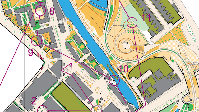
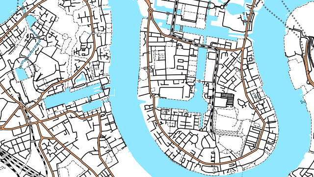
This orienteering map was produced in Adobe Illustrator for a special sprint race at the Queen Mary (University of London) campus in East London, including part of Mile End Park. The printed map was at 1:4000 and was produced to the ISSOM (International Specification for Sprint Orienteering Mapping) standard. Because of the larger scale, more detail is shown, such as crosses representing benches.
Printed. Based on Ordnance Survey mapping with the permission of Her Majesty’s Stationery Office. Crown Copyright. License No. 42323U. BOF Registration SE-08-624.
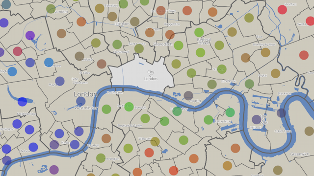
An interactive map showing the “colour” of each London ward, based on the results of the London Council Elections in May 2010. Each vote is considered to be red for Labour, blue for the Conservatives, and green for all other parties – the average “colour” can then be calculated and is displayed as a dot in the centre of each ward. The background is produced in Mapnik, with the circle symbology displayed using OpenLayers.
The visualisation can be viewed at http://casa.oobrien.com/misc/london/
Acknowledgements: Electoral data from the London Data Store. Ward and borough boundaries from Ordnance Survey Boundary-Line, part of the OS Open Data release. Contains Ordnance Survey data © Crown copyright and database right 2010. Background contextual data from OpenStreetMap, CC-By-SA OpenStreetMap and contributors.
OpenOrienteeringMap is an automatically generated map of the world, based on the OpenStreetMap dataset but styled for use in informal orienteering competitions.
The style here is the “Street-O” style, a minimalistic network-style map as used for street orienteering. The map is created on-the-fly using Mapnik, a map creation engine.
Medium: Web and print.
Acknowledgements: Data from OpenStreetMap, CC-By-SA OpenStreetMap and contributors.
Current status: Online for the UK. A new version of the user interface is in development.
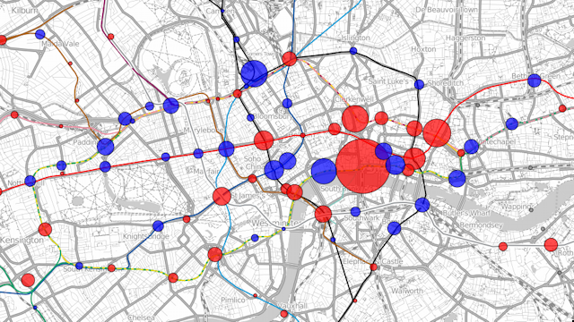
Visualisation showing the changes in use of the tube stations in London. The example here is showing the changes in total exits and entries (by foot) to the tube stations between 2008 and 2009. Blue circles show increases in numbers and red circles show decreases. The area of the circle is proportional to the changes in numbers. The largest red circle is for Blackfriars station which was closed throughout 2009. The surrounding stations show increased usage, compensating for this closure.
The visualisation can be viewed at http://oobrien.com/vis/tube/
Acknowledgements: Data from the Transport for London website. Background contextual and tube line data from OpenStreetMap, CC-By-SA OpenStreetMap and contributors.