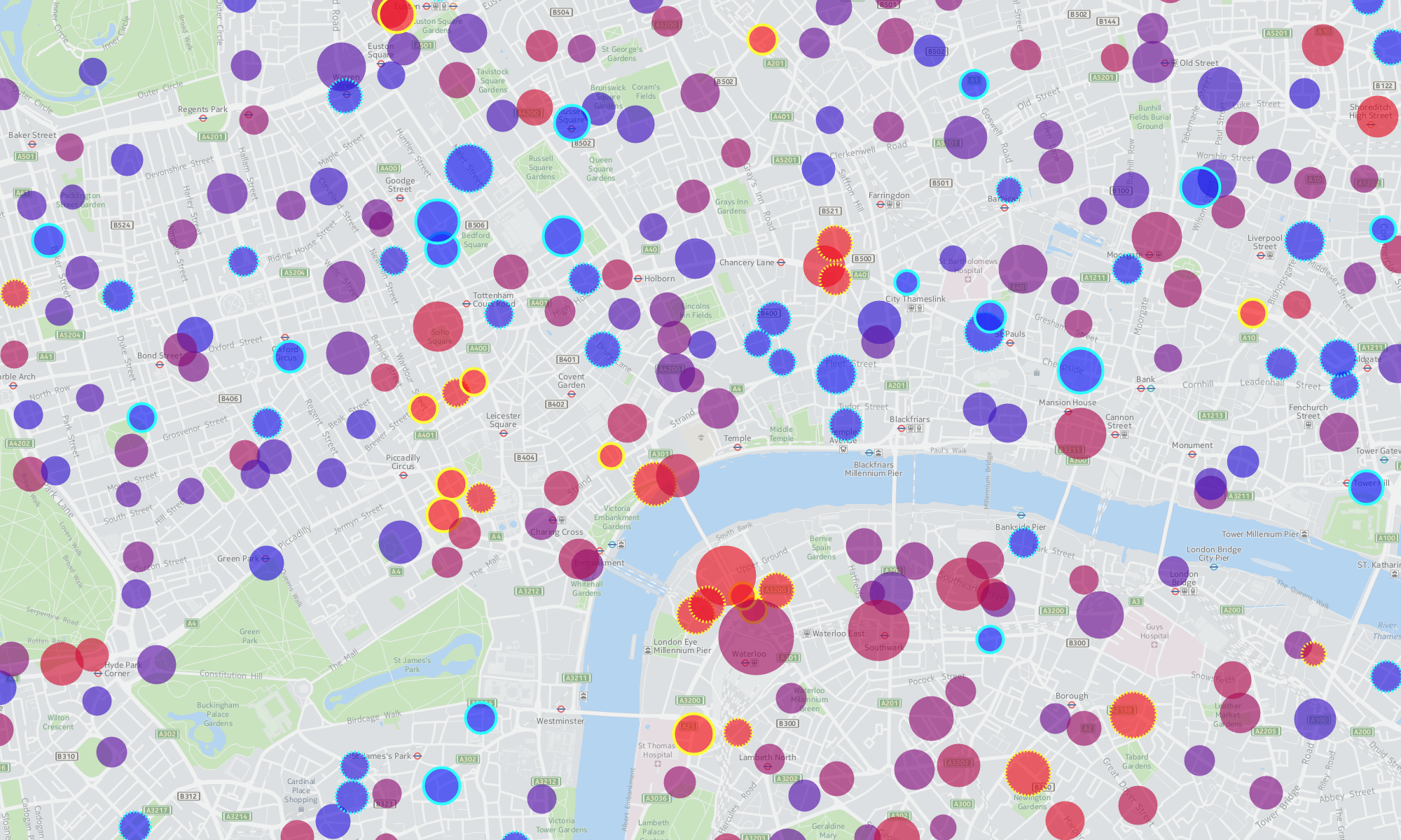
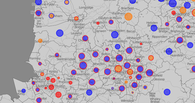
This can be viewed at http://vis.oobrien.com/election/. It was my earliest “coloured circles in centroids” map and led to a London Council Elections map as well as the Bike Share Map. It primarily shows the predominant “swings” of the votes between parties, as compared with the previous general election.
It was originally published shortly after the election in 2010, but has been recently (2013) updated to utilise the latest version of OpenLayers, allowing it to be viewed effectively on mobile devices. The styling has also been slightly updated, with the user interface elements changed from solid dark blue blocks to translucent rounded black rectangles. It was further updated in 2015, to include the results from the General Election that year, as well as rebrand it as part of the DataShine portfolio of websites.